
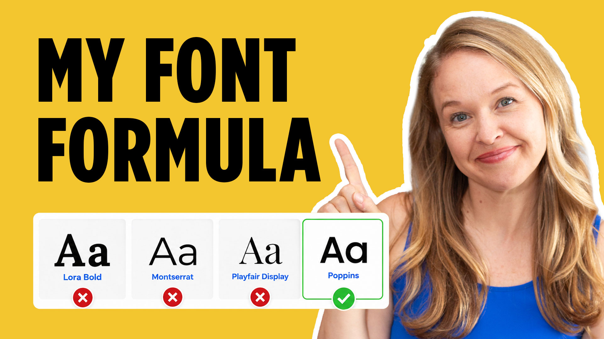
Selecting fonts is one of the most important skills you can develop as a graphic designer. Typography does more than make words readable—it helps communicate the personality, mood, history, and values of a brand. If you want more help building complete brand identities, grab my free Logo Design Workbook to follow along with your own projects.
In this tutorial, I’m going to show you my full process for how to select fonts for logo and branding projects using a real rebranding project as an example. Instead of simply scrolling through hundreds of fonts until something “looks good,” we’ll look at how to make typography decisions based on the client, the brand, and the overall design system.
How to Select Fonts Based on the Brand Personality
Before opening Adobe Fonts or Illustrator, start by thinking about what the brand needs to communicate.
For this project, I was redesigning the identity for the Foreign Language Academy, an interpreter business whose brand had existed for around 30 years. The goal was to modernize the identity without completely losing the tradition and history of the original brand.
That immediately influenced my typography choices.
I knew I wanted to explore serif fonts because serif typefaces often communicate qualities such as authority, trust, tradition, and heritage. Those characteristics made sense for an established company with decades of history.
But I didn’t want the final identity to feel dated.
That’s why I also started exploring slab serif fonts. A slab serif can retain some of that traditional personality while feeling stronger, cleaner, and more contemporary.
This is an important lesson when learning how to select fonts: don’t start with the font. Start with the feeling the brand needs to communicate.
Start Your Font Research With Adobe Fonts
Adobe Fonts is one of my favorite places to begin researching typography because you can quickly filter through different type classifications.
Inside Adobe Fonts, you can browse categories such as serif, slab serif, and sans serif. You can also enter your client’s actual business name into the preview field.
For the Foreign Language Academy project, I tested the word “Foreign” in both all caps and title case. Seeing the real brand name is much more useful than evaluating a typeface using generic sample text.
During this stage, I’m not trying to make final decisions.
I’m simply looking for fonts that feel interesting and appropriate for the brand.
Some fonts might have beautiful details but feel too decorative. Others may have so much personality that they overpower the name itself.
For this particular identity, readability was especially important because “Foreign Language Academy” is already a long business name.
I also take screenshots of fonts I like while researching. This makes it easier to compare several options without constantly jumping between browser tabs.
Test Fonts in the Real Logo Layout
Once I have a group of promising fonts, I move into Adobe Illustrator.
I type the client’s name over and over using different typefaces so I can compare them directly.
Because Foreign Language Academy is such a long name, I tested several layout variations. I looked at the entire name on one line, stacked versions, title case, and all caps.
This step is where font selection becomes much more practical.
A font might look fantastic in Adobe Fonts but completely fall apart when you start using it in the actual logo composition.
Testing typography inside realistic layouts helps you evaluate things like width, spacing, hierarchy, readability, and visual balance.
As I narrow the options down, I move my strongest choices onto a separate Illustrator artboard that I call my “Favorite Fonts” page.
That gives me a much smaller group of typefaces to work with as I begin developing the actual logo concepts.
Pair Serif and Sans Serif Fonts to Create Hierarchy
One of the biggest discoveries during this project was that using a serif font for the entire business name felt too visually heavy.
The solution was font pairing.
I began combining a slab serif with a sans serif. Eventually, I used the slab serif for “Foreign Language” and placed “Academy” underneath in an all-caps sans serif.
This combination solved several problems at once.
The slab serif maintained the authority and heritage we wanted, while the sans serif introduced a cleaner, more modern feeling. Changing typefaces also helped visually separate the long business name into smaller pieces.
That’s one reason learning how to select fonts is about more than finding one perfect typeface.
Sometimes the strongest solution comes from understanding how two fonts can work together.
A good font pairing should create contrast without feeling disconnected. The typefaces should have different jobs while still feeling like they belong to the same visual system.
Test Typography With the Logo Icon
Typography should never be evaluated completely separately from the rest of the identity.
Once I started developing icon concepts, I began placing those icons next to my strongest font options.
These combinations were still rough, but they allowed me to ask an important question: Does the typography feel like it belongs with the symbol?
The final icon included subtle serif-inspired details that connected nicely with the slab serif used in the wordmark.
Those small visual relationships help make a brand identity feel intentional.
Instead of having an icon, font, and colors that all feel like separate decisions, you want the entire identity to feel like one connected system.
Think Beyond the Primary Logo
When choosing fonts for branding, remember that your typography needs to work across multiple logo variations and brand applications.
For the Foreign Language Academy, we created a stacked primary logo, a horizontal secondary logo, and another lockup that included some of the company’s services underneath.
The same sans serif used for “Academy” worked well for that supporting information.
At the end of the project, I created a simple brand guide showing the client their logo variations, colors, and typography.
This makes the identity easier for the client to use consistently after the project is complete.
Great font selection isn’t just about creating a beautiful logo. It’s about choosing typography that can support an entire brand.
Final Thoughts on Choosing Fonts for Branding
The next time you’re trying to figure out how to select fonts for a logo, avoid choosing based only on what looks attractive.
Start with the brand personality. Research several appropriate type categories. Test the fonts using the actual business name. Compare different layouts. Experiment with font combinations, and make sure your typography works alongside the logo icon and the rest of the identity.
The more you practice connecting typography choices to design strategy, the less font selection will feel like guessing.
And if you want to keep building your design skills, download one of the free design resources below or try one of my recommended tools to practice your next branding project.
🎁 FREE RESOURCES FOR DESIGNERS
- 👉 Try Canva Pro free for 30 days → https://partner.canva.com/kOARLL
- ☕️ Start your 7-day free Adobe Creative Cloud trial → https://adobe.prf.hn/click/camref:1101lKN6K
- 🎨 Shop my favorite design & creator tools → https://amzn.to/4tAYQwN
- Logo Design Workbook — https://cryestudio.systeme.io/logo_design_workbook
- Logo Export Cheat Sheet + Template — https://cryestudio.systeme.io/logoexporttemplate